HONEY GUMMIES
WHAT’S UP: Honey Gummies! A sustainable gummy candy made with natural honey! For this project, the assignment was to create a quick and straightforward magazine ad, logo, and physical package for this delicious snack. The idea of this product is to be incorporated with the Bee Nourish Association, a group of folks that help save the bees!
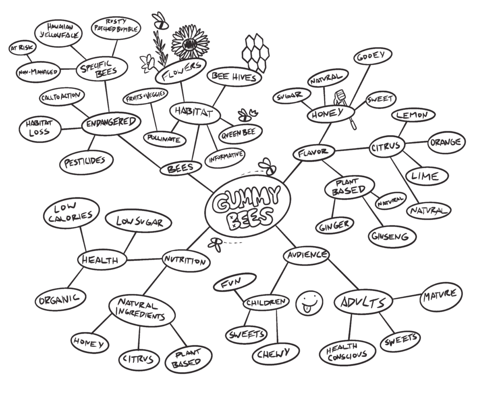
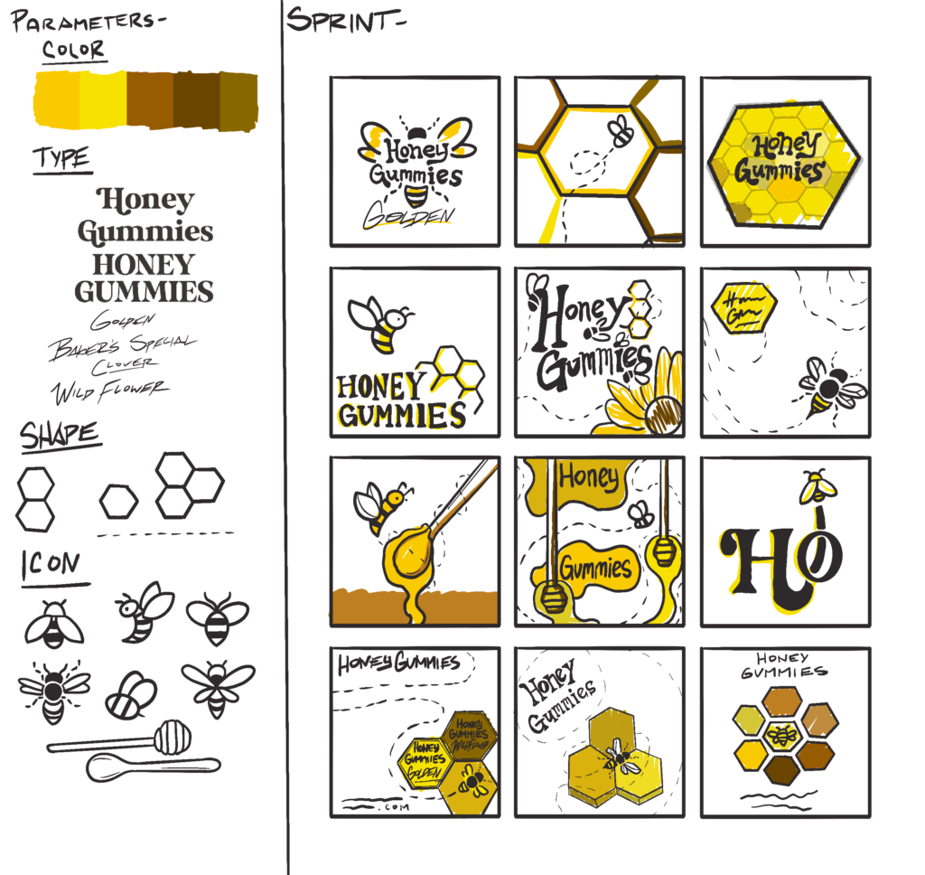
LOGO + AD DRAFTS: I started with three quick brainstorming exercises! The first was a mind map, organizing my thoughts on the product and developing what this snack would be. After the branding, I gave myself different parameters to use. After deciding on the parameters, I started to start sprinting and quickly sketched out whatever ideas I had in my head.
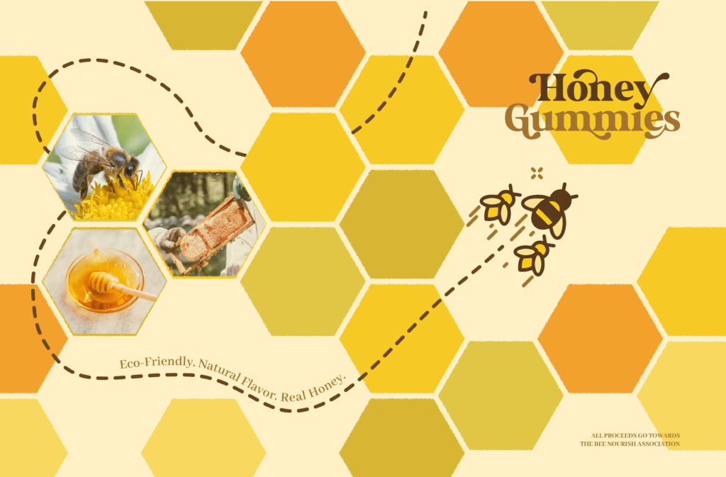
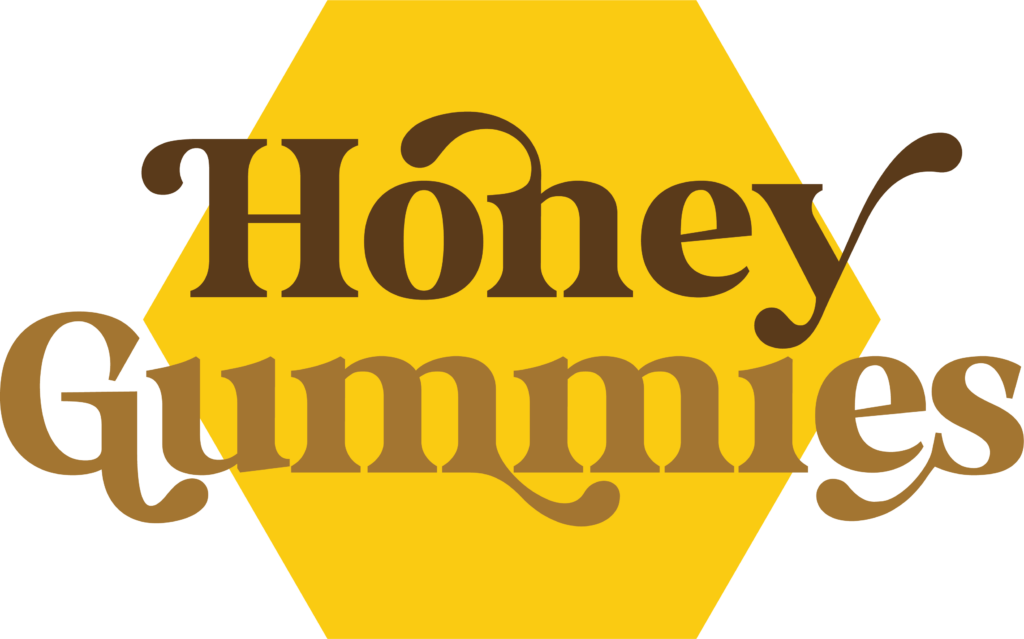
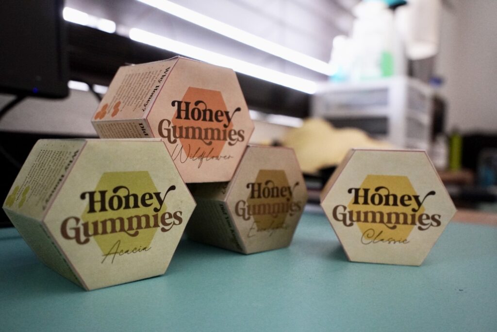
LOGO + AD: After further development + multiple trials and errors, here it is! The logo is eligible, captures the essence of bees and honey, and features a fun honey-like typeface! The advertisement uses the same branding of shape, color scheme, and iconography as the packaging!
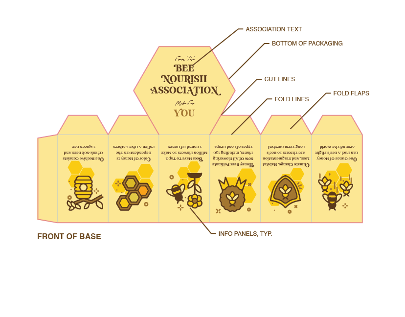
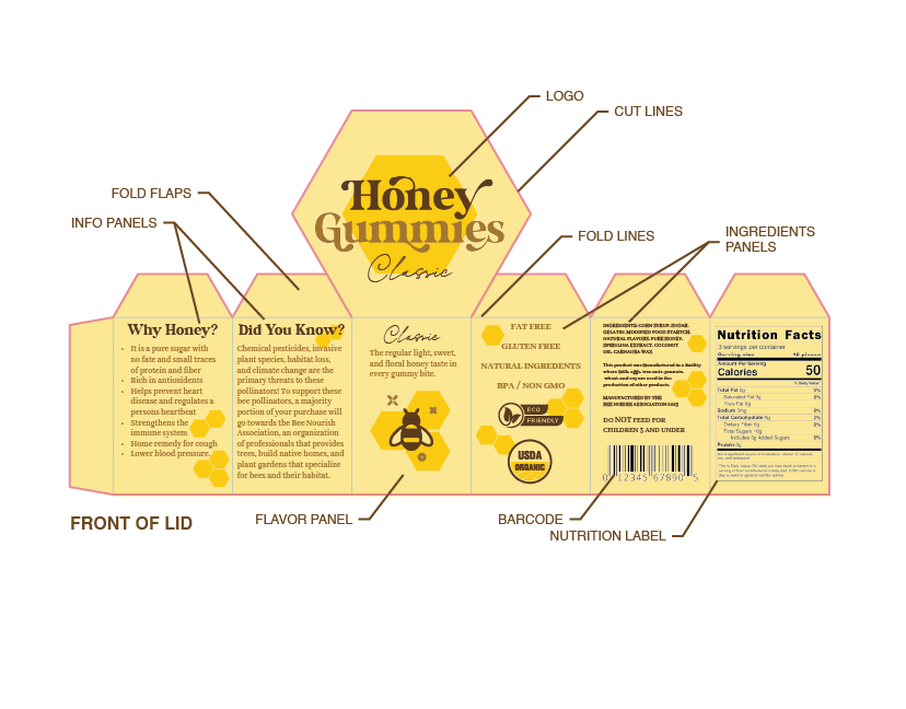
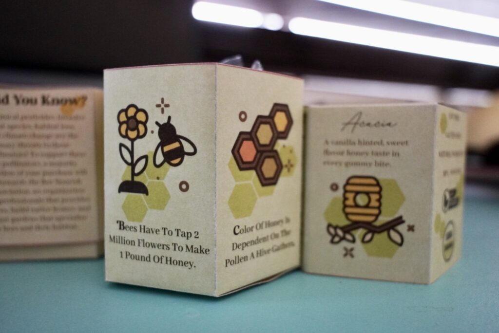
PACKAGING BLUEPRINT: The product itself! Like classic honeycombs, its hexagonal shape features information about bees. The packaging will come in different colors based on the flavor of honey. Informative packaging with a unique shape that encourages reusability.
